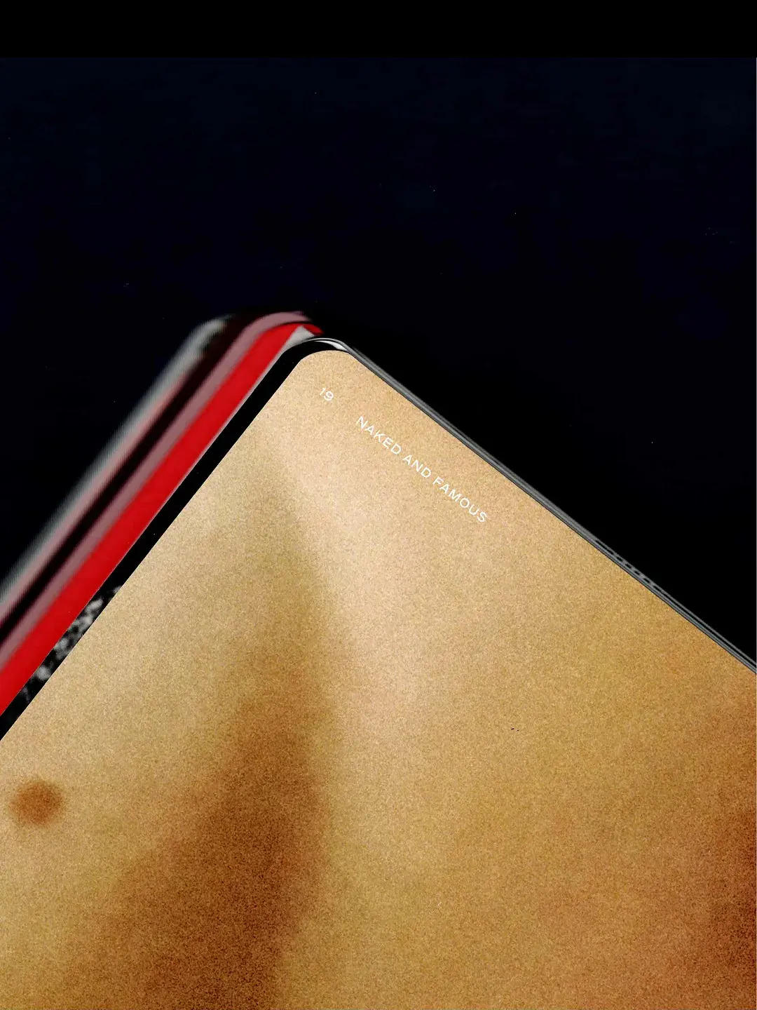
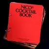
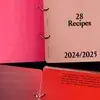
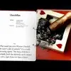
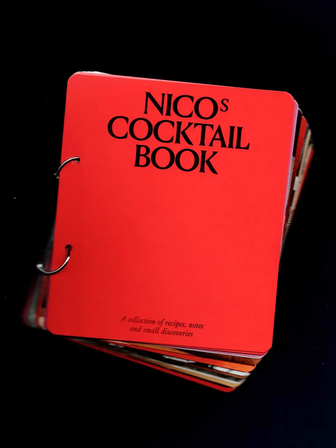
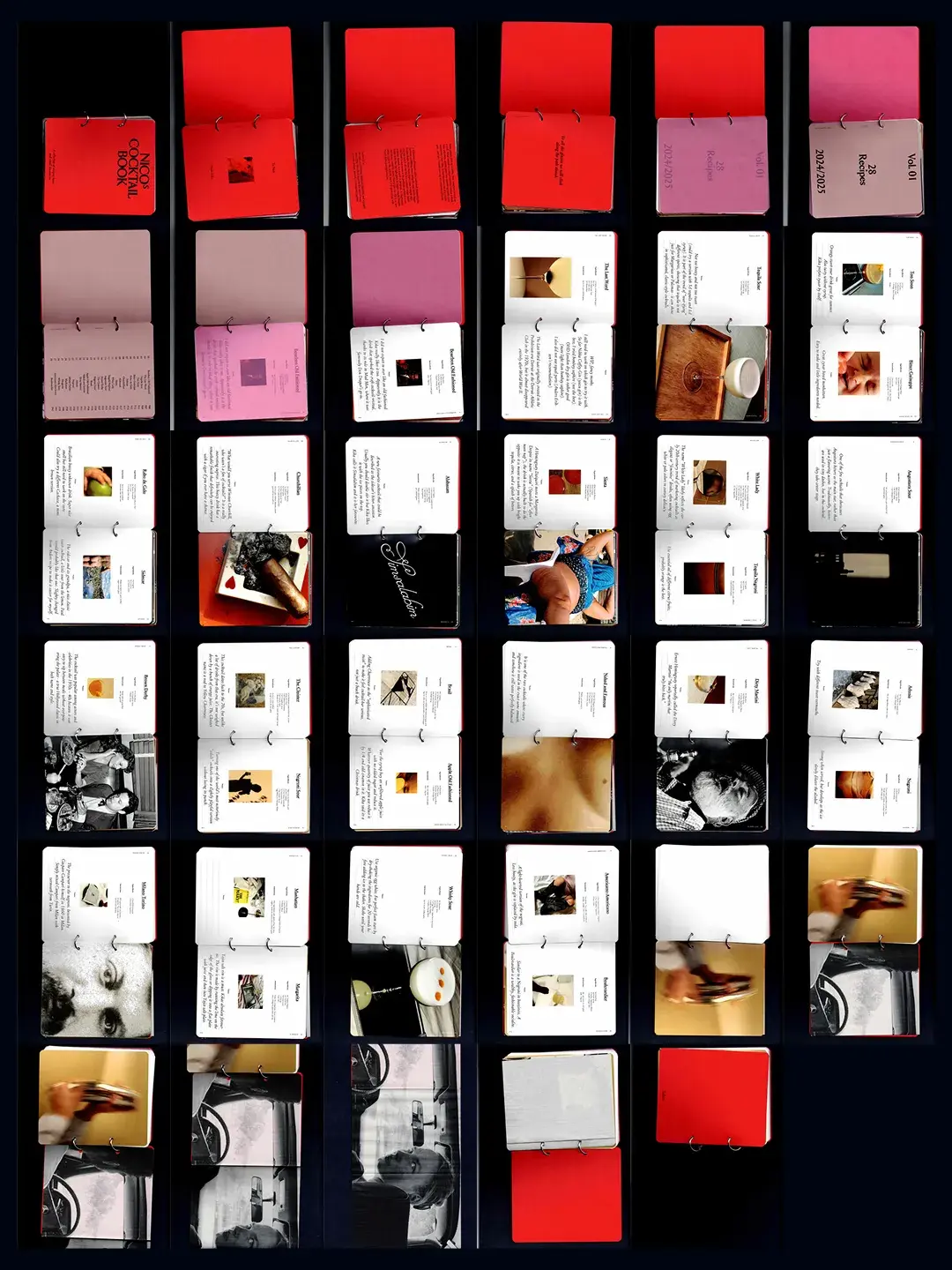
Nico's Cocktail Book
Book design
I had the beautiful honor of designing Nico’s Cocktail Book. A wonderful gift from my friend, Kika, to her love, Nico. A small ring-bound collection of love and recipes from his newly discovered superskill.
This is only Vol. 1.

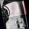
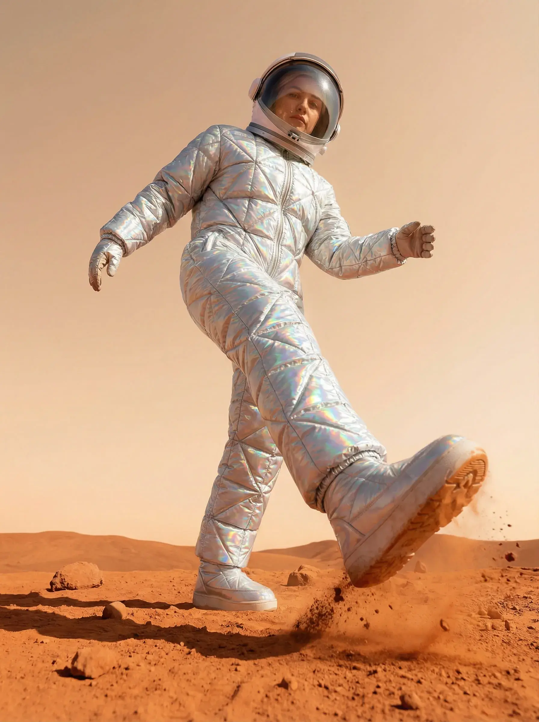
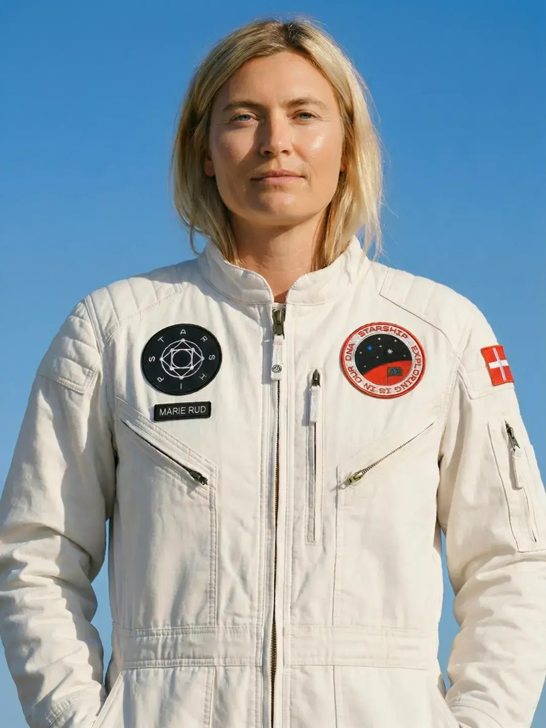
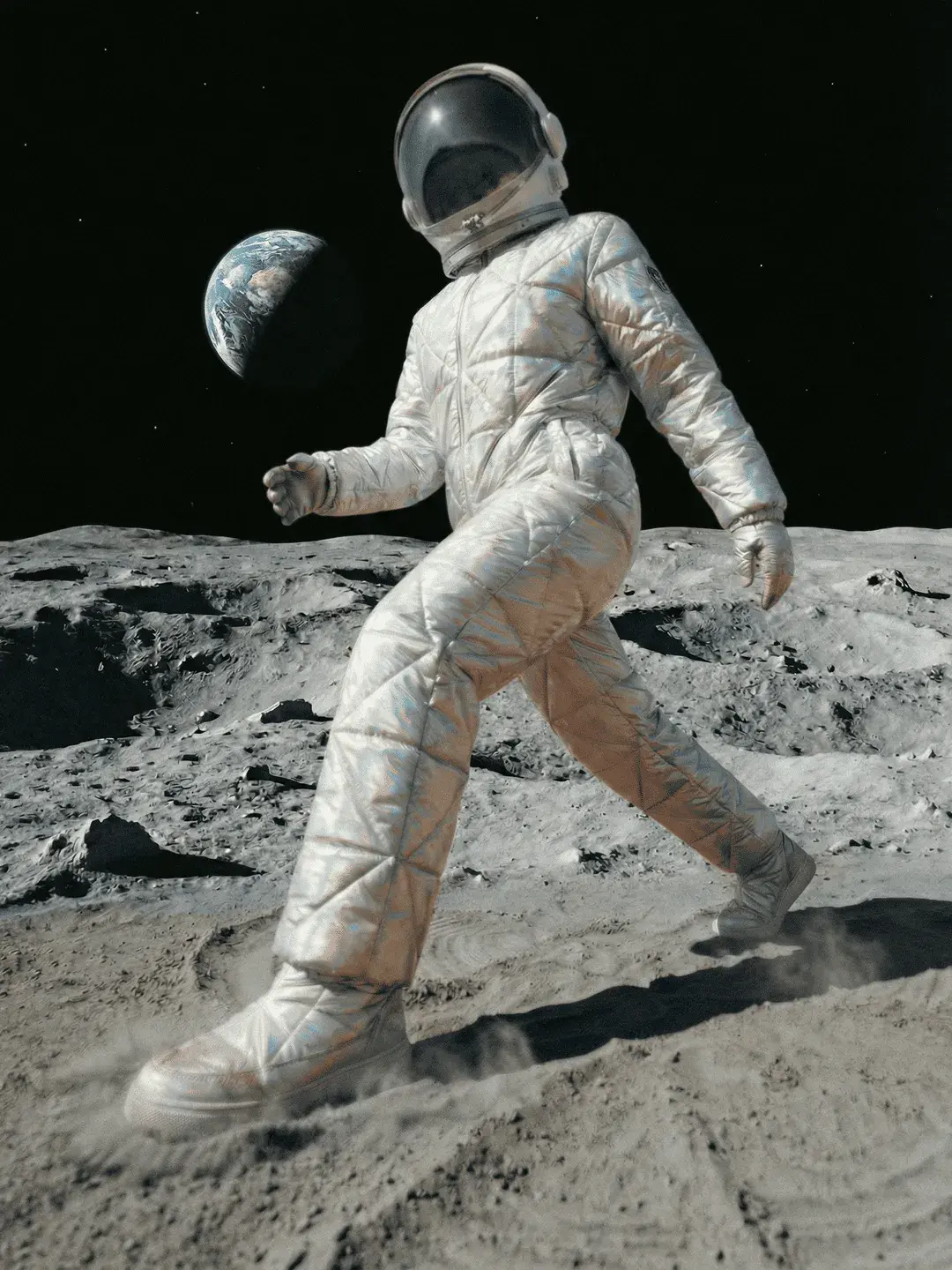
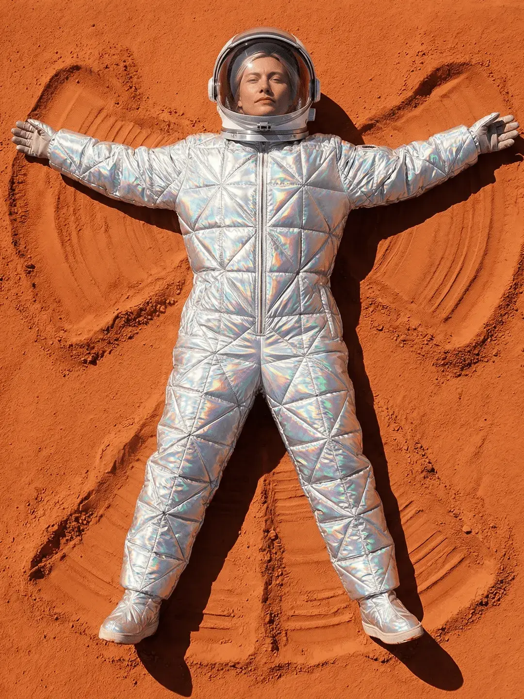
STARSHIP
Personal project
Engines lit. 4, 3, 2, 1. Ai-booster ignition. Liftoff. 🚀
I am using my graduation project from 2019: STARSHIP — a visual identity for SpaceX’s commercial spaceship, as a visual framework to crack that AI code.


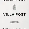
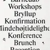
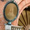
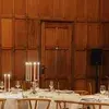
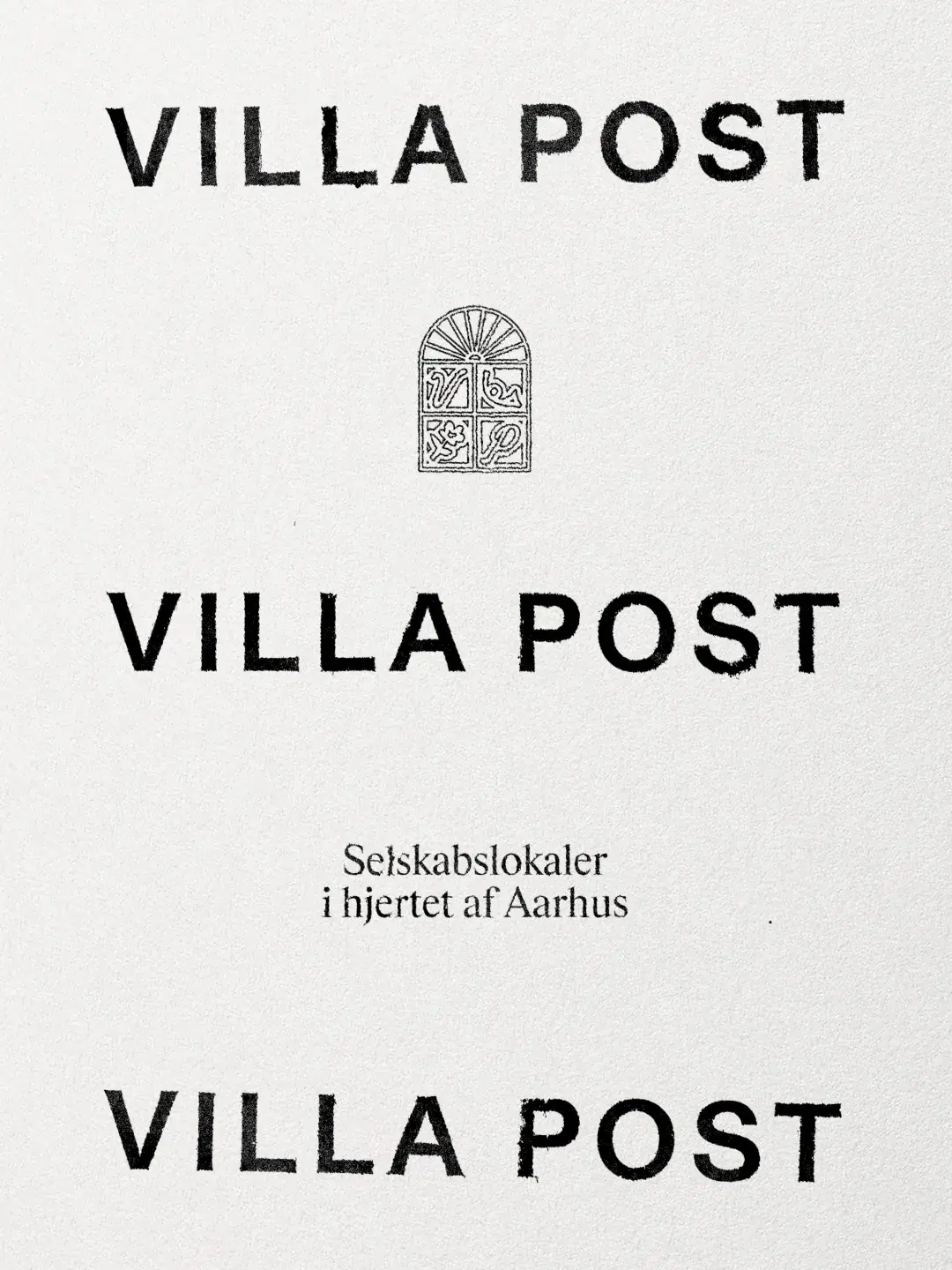
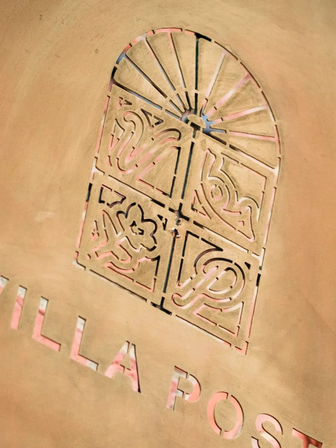
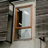
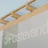
Villa Post
Visual Identity
Visual identity for Villa Post. A new event venue in the heart of Aarhus located at the old Postal Building. All curated by Madklubben.


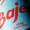
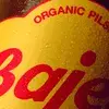
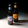
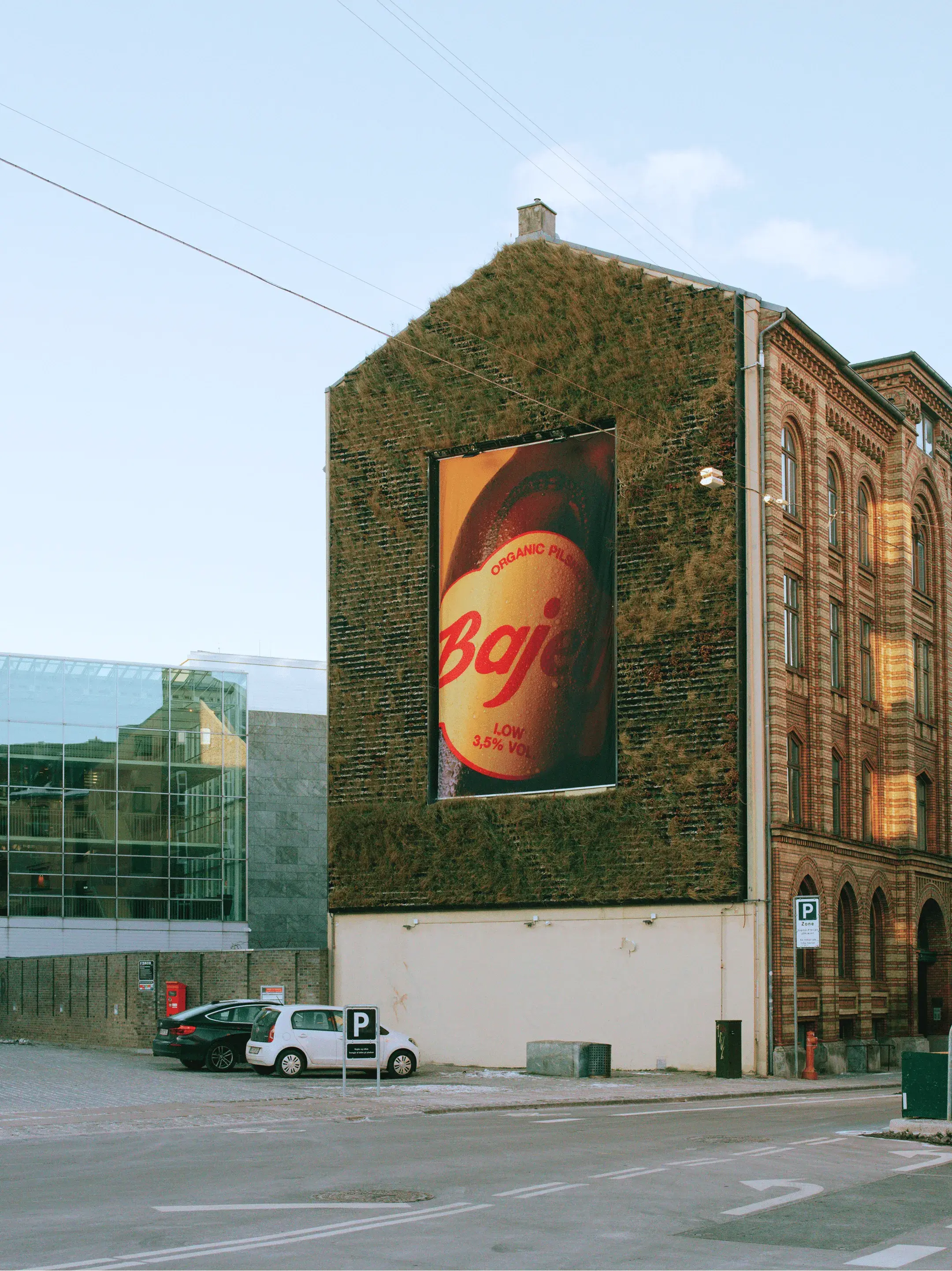
Bajeur
Packagning
Packaging design for the newest members of the Bajeur Family from Depanneur. Easy is red, Low is yellow and Free is blue.

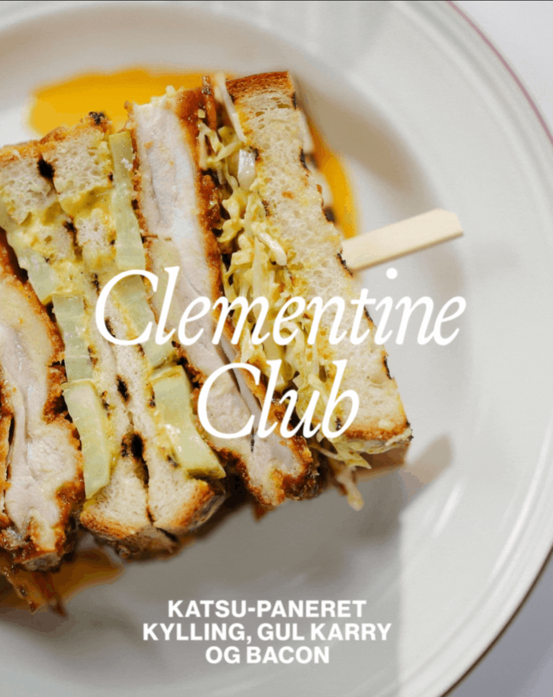
Clementine
Visual Identity
Clementine is located on Skt. Clemens Torv in the heart of Aarhus. I designed a visual identity subtly inspired by its historic name and location — combining a refined typeface based on Roman inscriptions with abstract illustrations drawn from gastronomy and local symbolism.

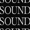
((SOUND))
Identity + website
SOUND is a creative community for musicians and artistic entrepreneurs. The identity visualizes the energy of music through a simple typographic idea: parentheses as sound waves. The result is a bold and minimal identity that amplifies both name and meaning.

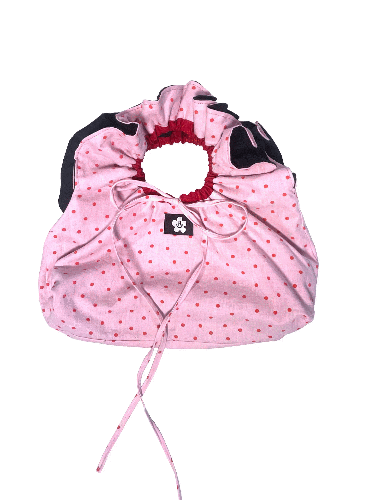
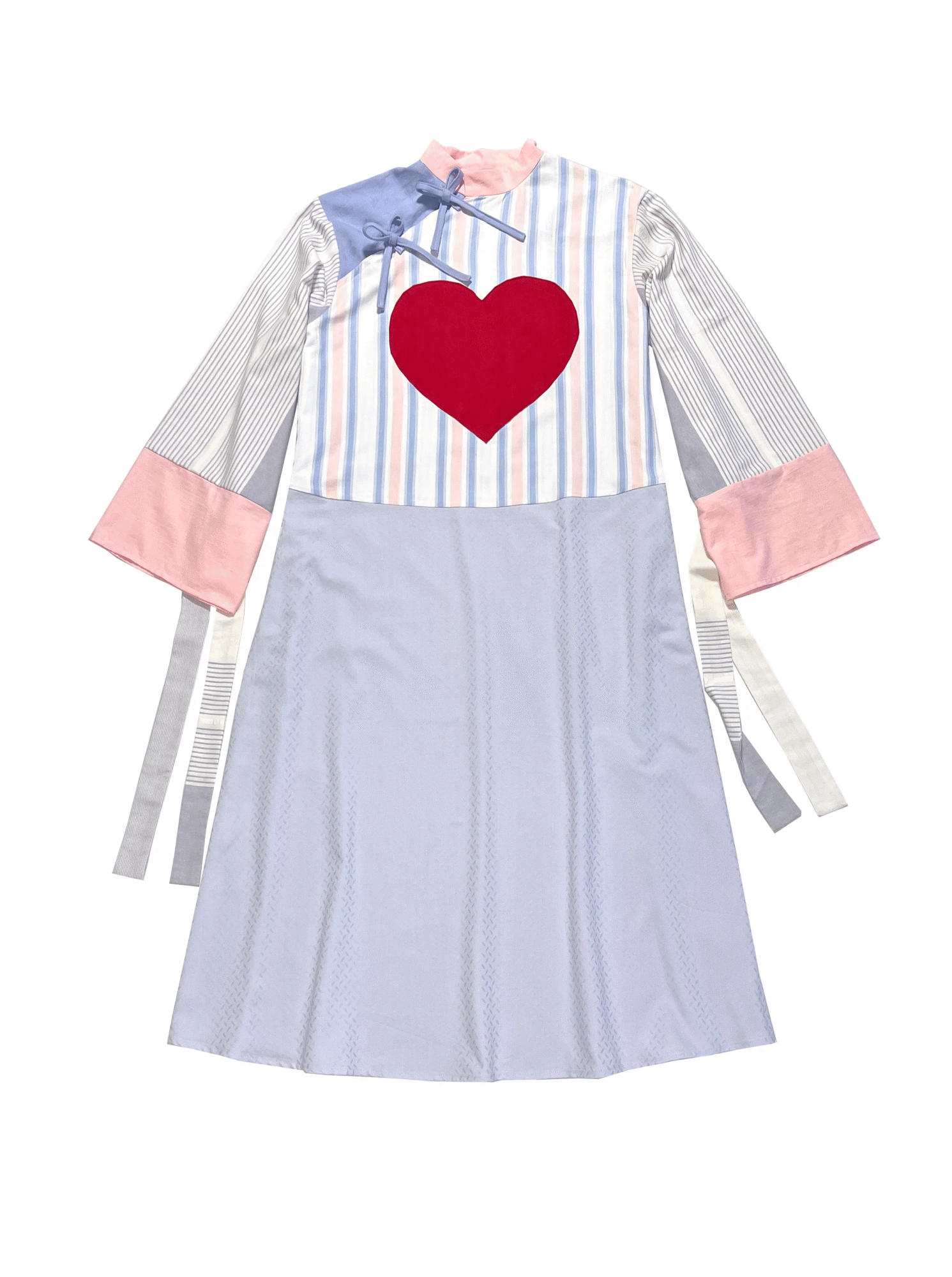
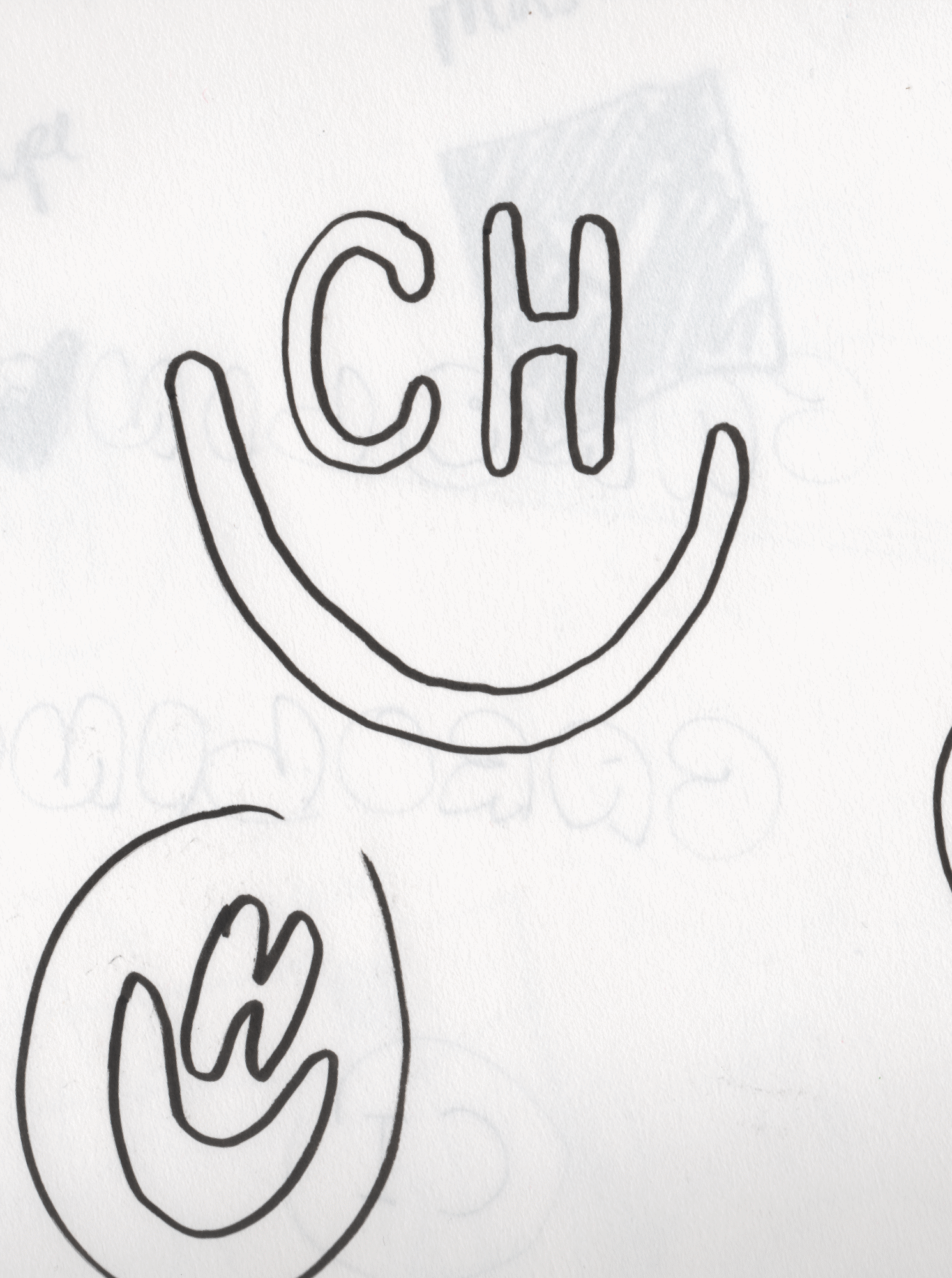
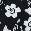
Caroline Hundsholt
Logo
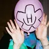
Caroline Hundsholt is a Copenhagen-based fashion designer using secondhand textiles to create unique pieces and DIY sewing patterns. I designed her logo; a cute CHMILEY combining her initials (CH) with her expressive, ever-changing style. Playful and flexible and easy to recreate by hand, reflecting her intuitive, hands-on way of working.
Caroline Hundsholt

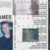
18 FRAMES
2022
Between the first and last frame in cinema lies infinite possibility. The visual identity for Denmark’s independent film school, 18 FRAMES, explores that space — a system shaped by rhythm, timing, and the movement of type based in the concept of framerate.
Visit 18FRAMES

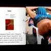
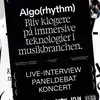
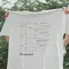
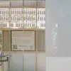
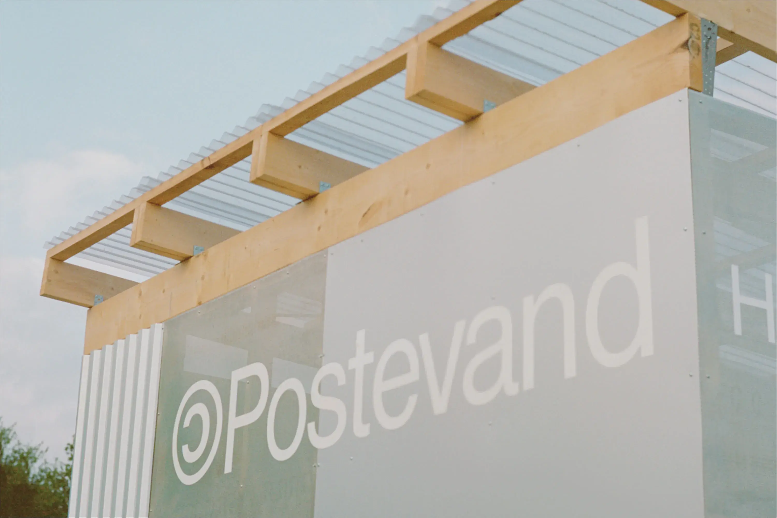
Postevand
Branding
Postevand promotes tap water as a sustainable alternative to bottled water. For Roskilde Festival 2023, they launched five pavilions and ten refill stations. I designed the visual identity across all touchpoints including the official Postevand T-shirt.


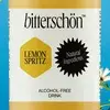
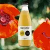
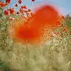
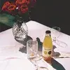
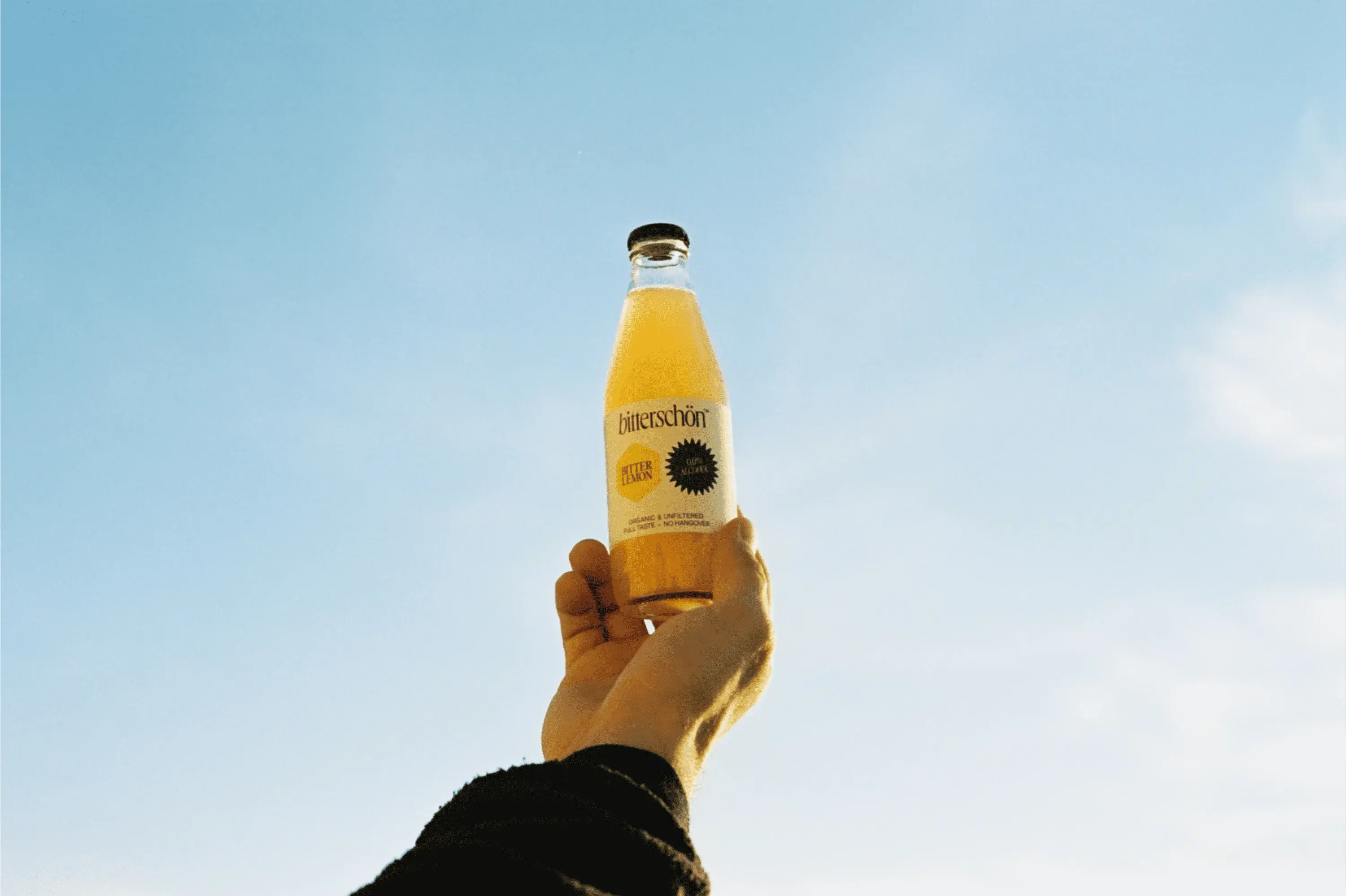
bitterschön
Packaging
Bitterschön is a non-alcoholic bitter. At Barkas, we created an identity built on expressive typography and geometric flavour symbols — a playful yet refined system, designed to scale as the product line grows.

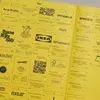
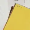
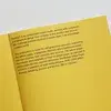
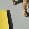
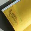
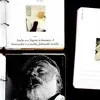
Barkas Yellow Pages
Book design
A 160-page publication celebrating the creative output of Danish agency Barkas between 2016 and 2020. I led the creative concept and design, drawing inspiration from the classic yellow pages — those iconic business directories where companies once showcased their services. The project was created during my time at Barkas.
Visit Barkas
Photography by Hilda Edith